Share this
As an independent financial advisor in today's digital world, a website isn't really a nice-to-have—it's a must-have. It's also not a to-do to check off your list never to think of again. As your business grows and evolves, your website will too. I always encourage XYPN members who are launching firms to think of their website as an essential part of their business that will need to be revisited every few years.
It should come as no surprise that not all advisor websites are created equally. The ones that are masterfully designed are not only a cut above aesthetically—they also bring in more leads and convert more leads to prospects. So, what exactly helps a website stand out from the crowd?
To answer this question, I enlisted the help of some of my XYPN teammates. Let's dissect their top picks below to get a better idea of why these websites are winners.
#1. Experience Your Wealth
Aimee Arnaud of XYPN's sales team chose Experience Your Wealth, Jake Northrup’s site as her top pick. Why? I'll let Aimee tell you:
“I chose him because his website is very clear on niche and it resonated with both my husband and me (dual income millennials that love to travel and want to retire early).”
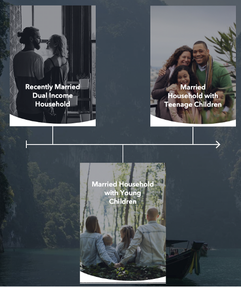
Right on the homepage Jake states, “We help travel-loving young families live a life they never want to retire from.” The call to action follows suit with “Do you have young kids?” Any visitor will know right away if Jake’s on the same page they are. As you continue on through his site, the timeline of client types draws them into their own journey so they can determine if they feel a connection with Jake and his firm.
Note on the ongoing versus one-time planning descriptions Jake doesn’t offer one-time plans if the prospect makes over 200K. With this information presented so clearly, Jake's prospects know what they are getting and prescreen themselves, so the quality of these prospects will be worth his time when he has those first appointments. Jake’s website was designed by Zach Swinehart.
#2. Greenhouse Money
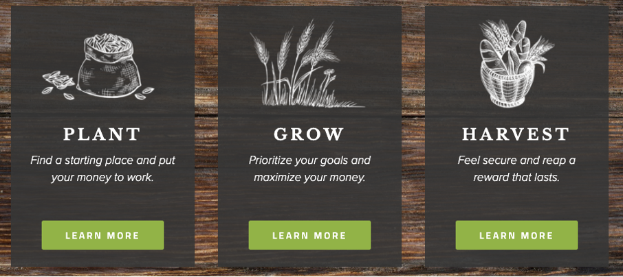
Greenhouse Money sticks with their theme and clearly knows who they're targeting. I love the pricing comparison that gives visitors visibility into fees before they meet with an advisor at the firm. The theme of nurturing and growth continues throughout the site. Note the use of “membership” benefits, which conveys a sense of community—who doesn't love to feel like they're part of something special?
On the "About Us" page, you'll notice something a little, well, different, about co-founders Jason Murray and Jordan Peace—they clearly have a love of trucker hats.
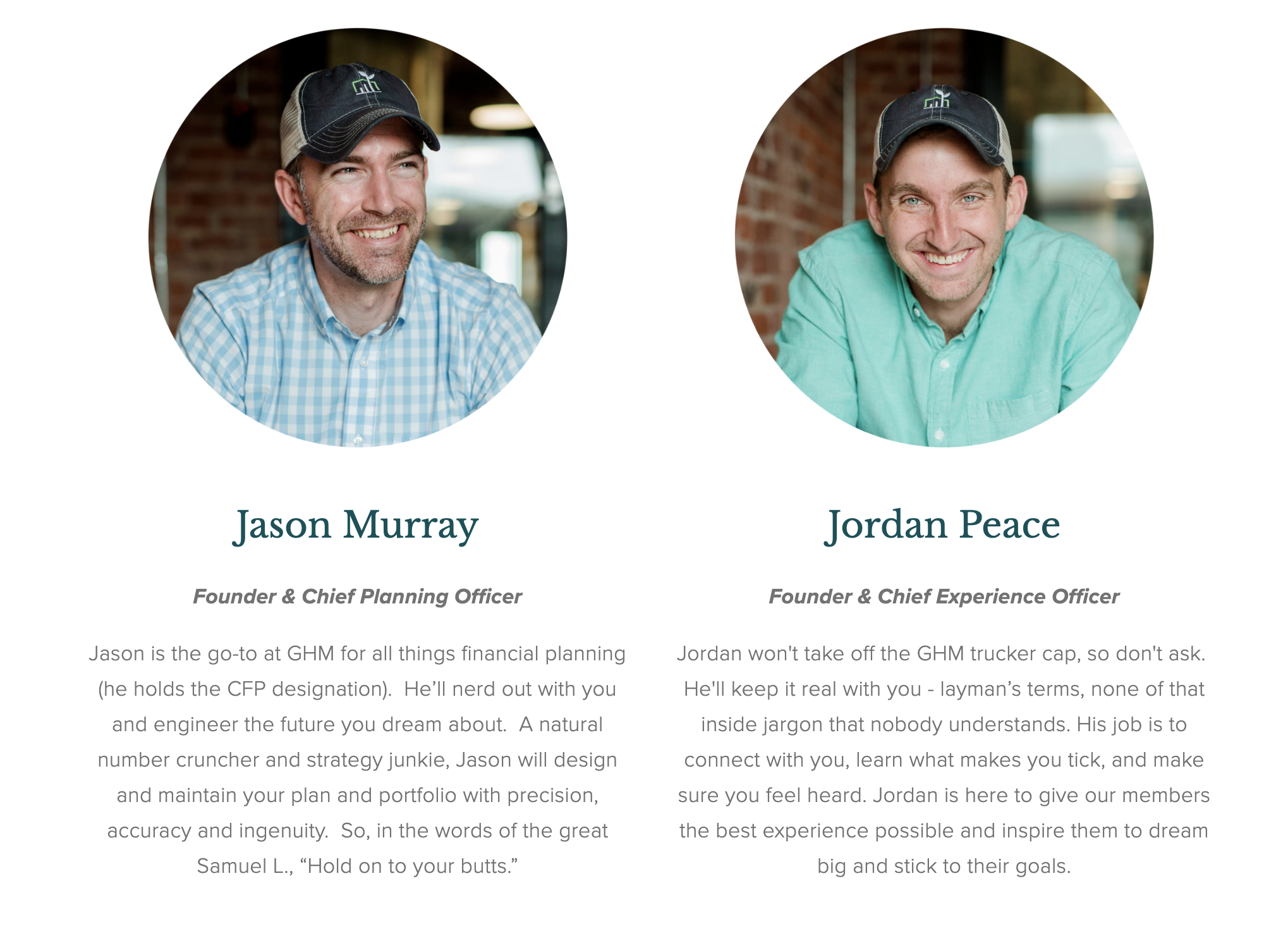
“Jordan won't take off the GHM trucker cap, so don't ask.” You may love it, you may not, but you know what you are going to get. The welcome video is perfectly done for their casual tone and includes my favorite, a presumptive close. “The call you are about to schedule”—who can resist that?
Your services are worth every penny, and maybe even more? Find out if you're charging enough →
#3. 2050 Wealth Partners
I love the new 2050 Wealth Partners site. There’s so much action here both verbally and visually. The word choices - impact, builders, design, partner - draw you into knowing things are going to change when you work with Lazetta and Rianka. Even the imagery is filled with action and a feeling of fun through hard work. I especially like the color palette they have chosen. It uses soft colors to create a safe and comfortable tone without the "pinkification" that you see so many brands overuse in an attempt to appeal to women. Everyone will feel comfortable here.
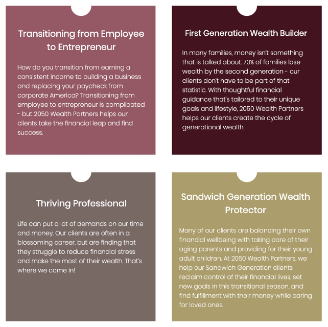
The planning path and pricing information are complete and straightforward . The “Who we serve” sections make it clear who will find a planning home here. This site was designed by Sugar Taylor.
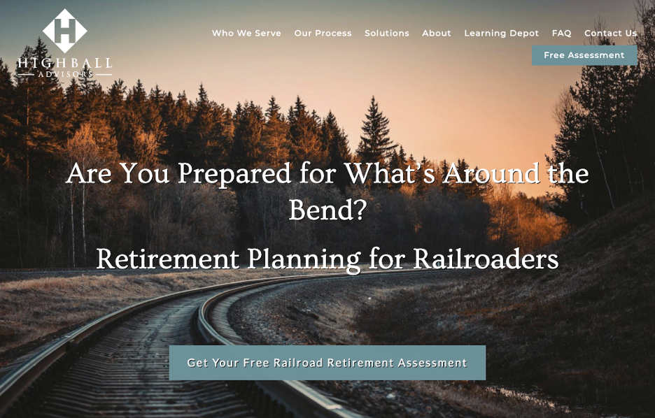
#4. Highball Advisors
Carolyn Dalle-Molle, XYPN's Marketing Coach, loves that Highball Advisors is all in on their niche.
“John decided on an ideal client avatar, and went for it. His message is clear, his value is direct, and his website is compelling. You can see how people in the railroad industry looking for retirement would feel very 'at home' on John's website. They'll feel like they're in the right place, and in the hands of an expert. Choosing a specific client (and speaking directly to that person with every word on your website) is choosing growth.” The call to action continues the push with a niche specific “Railroad Retirement Assessment.”
With such a specific CTA, John does a great job of attracting the right prospects and repelling the wrong ones. Any railroader who sees "Railroad Retirement Assessment" will know they have found someone who understands their unique issues. I personally enjoy John's somewhat kitschy but definitely adorable blog the “Learning Depot”. Take a look at John’s welcome video. He asks for input on topics may have missed and invites people to subscribe. Don’t be shy. Ask for the follows and subscriptions you want. The Highball Advisors site was designed by Twenty Over Ten.
#5. Mana Financial Life Design
XYPN Product Owner, Taylor Deardorff, recommends Mana Financial Life Design as a site where the firm theme and vibe are really well communicated. You won't find generic imagery that is disconnected from who they are. I especially love the soothing colors. The peach and cream tones in the images closely complement the site color palette.
Beyond aesthetics you see a clear path of activity. You will know what to expect and what you will get as a client. I love the phrasing “We revisit each phase each year”. If you want one and done, keep walking, these planners want to work with you for a long time. One tidbit that impressed me was the site was designed by a colleague working on her PhD in visual data science who works part time at Mana. Cristina and Stephanie invest in their user experience and data visualization.
#5. Ten Talents Financial Planning
While researching websites for this blog, I navigated them as if I were a prospect. I was pleasantly surprised to find Kaleb Paddock's chatbot on Ten Talents Financial Planning's site truly felt like I was communicating with a real person. Come to find out, I was communicating with a real person. Kaleb responded, which made me a little nervous about his ability to focus, but very impressed as a potential client. No poorly functioning artificial intelligence for Kaleb. It goes straight to his phone.
Another element I love to see on site is case studies. These are definitely not testimonials, but rather fictionalized accounts of work you might do with a client. This gives the prospect a way to see themselves in your site and realize you truly understand their specific issues. I have seen a variety of ways planners use case studies. Some use generic names, others use TV or movie characters that prospects can relate to, or adorable avatar names like Freddie FIRE and Rebecca Retiree. The key point is that the prospect connects and feels understood. 
There are so many calls to action on Kaleb’s site. I love a site where, no matter when the prospect decides to take the next step, they can do it. Don’t make someone search for the scheduling button or contact link once they decide to contact you. Make it easy anywhere along the way for them to take the next step. A common element I saw on several sites for this piece is the “Start Here” button. Sometimes people won’t even know where they should look, so “Start Here” gets them moving forward, which is exactly what you want your site to do. Ten Talents website is by One Week website.
#6. Fyooz Financial Planning
Fyooz is a favorite of XYPN Graphic Designer, Audrey Moss. Natalie and Dan Slagle bring their energy to the site and have created another space where you can see yourself connecting with them if you are their target audience. The color choices are fresh and modern, there is a style that exudes joy for the planning process. No stodgy retirement planning here. I am always on board with a quiz or tool for a call to action and Fyooz delivers.

There are so many connection points so that it is easy to connect whenever you decide to take the next step. Having a blog and welcome video adds more depth to being able to decide if you want to work with a planner. Website and branding by Josh Stock Design

#7. Incline Wealth
A personal favorite of BB Webb’s, XYPN’s Sales Coach, is Incline Wealth. Local images are perfect if your clientele is specific to a region or town, but Jon takes it to another level with a video that features his clients in the spotlight, not him. It’s a very soft sell, but the message is clear that he values his community and the small businesses in it. Jon’s services page that shows exactly what each type of client can expect is an excellent way to help people understand the process before they spend valuable prospective client appointment time with a planner.
#8. True Abundance Advisors
True Abundance Advisors website uses imagery and colors that are calming and set a tone to show you that Laura Rotter is not your typical financial planner. Her welcome video is clear about who she wants to help and why, so before inquiring any prospective client will know if they are a good fit for Laura’s firm. Her blog continues with a combination of self help and finances. Once again, this will resonate with some, not others. As for me, she had me at that peacock feather!
#9. 2050 Capital Financial Advisors
Another of Carolyn Dalle-Molle’s favorite designs in 2050 Capital Financial Advisors. The clean crisp visuals are modern and engaging. One trip to Colin’s blog and you know who he’s talking to and where you fit in.

#10. Gunder Wealth Management
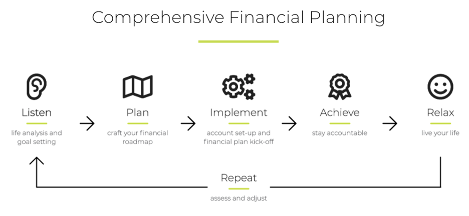
Our marketing team loves Ashlee deSteiger’s site for Gunder Wealth Management. The clean lines and easy path from what Gunder does to who they serve and what the results are show every visitor what to expect. The "Working Together" page shows a prospective client where they are headed and includes “Repeat: Assess and Adjust” to show that the relationship is ongoing.
Hopefully at least one thing was clear looking through these websites: there is nothing "cookie cutter" about them. Each site communicates a different message, a different tone, and evokes different emotions from the visitor. As an advisor, your task is to determine who you want your site to speak to and how you should speak to them—to do that, ask yourself how you want people to feel when they visit your site. Use the combination of design, imagery, color scheme, and words to create a path that leads to you and showcases the unique client experience you offer.

 About Arlene Moss, Executive Coach
Arlene gets a kick out of helping financial advisors get over being overwhelmed and take on their frustrations so their businesses soar. Arlene works to ensure XYPN members are able to help their clients prosper while creating a sustainable business model. Through XYPN Academy and one-on-one coaching, members get the support they need to grow their businesses and overcome the challenges that come their way.
Share this
Subscribe by email

Coaching for Better Time Management: Prioritizing Organic Growth in Your Daily Routine
April 7, 2025
5 min read

How to Determine Your Pricing and Services as You Launch Your Firm
Jan 31, 2022
9 min read