Share this
I’m not that old, but I remember being years into my career when my office first got internet service. The bandwidth was low, so we needed to ask permission to dial up and to justify each visit to the world wide web.
In those early days, I don’t recall ever needing anything online, so I mostly took a pass on cruising the “information super highway.”
I blinked and everything changed. My daughter got her first cell phone to access the internet in first grade. It was a hand-me-down with no service contract, but she could access everything a six-year-old would need via WiFi. She’s 13 now and high-speed video streaming seems to be a matter of life and death.
It goes without saying that our reliance on the internet has evolved. Now, I rarely sit down in a restaurant without first sizing it up online. And that’s only for the minor investment of a meal. For a major decision such as choosing a financial advisor, you can bet your potential clients are scrutinizing you and your firm online. Your website has an important job to do.
Your website is the gatekeeper between you and your livelihood. It must make a positive impression. It must build trust. It must speak to the exact people with whom you want to work.
That’s a tall order. Is your site up to the challenge? Review the ten must-haves below to be sure your website is the best ambassador for your business.
1. Clear URL
Before you begin building a website, pay a visit to GoDaddy.com to find a practical URL. In fact, I recommend doing this before you even decide on a name for your business or register your firm. You’ll want to get a .com address if you can, as this is the most common extension. Prospective clients will assume you have a .com website. Imagine this scenario:
Your firm is named Confusing Financial, but ConfusingFinancial.com is taken. You settle for ConfusingFinancial.co instead. Unfortunately, the advisors at ConfusingFinancial.com are getting all of your business.
On the URL front, be sure you own it. If you hire a contractor, intern, web developer, etc. to build your website, be sure they’re not registering this valuable firm asset in their own name. Registering a domain name is cheap and easy, so there is no need to outsource this task.
2. On-Target Imagery
Make a great first impression on your homepage with imagery that speaks to your niche. If you serve farmers, a beautiful rural landscape is great. If targeting athletes, how about a locker room?
Like every element on your website, go for quality when selecting images. The quality of your website represents the quality of your service. Be sure images are sized correctly and are of high enough resolution to look crystal clear.
My go-to source for great images is Shutterstock. Depending on your package, you will pay between 27 cents and $14.50 per image.
Considering a picture is worth a thousand words, that’s a bargain.

3. Simplicity
Yes, your website has a big job to do, but that doesn’t mean you should overthink or overcomplicate it. The prevailing aesthetic today is clean. Make it easy for your visitors to navigate to the information they’re seeking and to find the answers to their questions.
Review each page of your main navigation to ensure you’re following these best practices:
- Eliminate distracting bells and whistles
- Pick one font and stick with it
- Develop a color story for a consistent look
- Incorporate white space...white space is your friend, not foe
- Style imagery to have a consistent look & feel
Know where you want visitors to go and set them on that path. XYPN’s content manager, Kelly Moorman, adds, “Placement matters. Put the important stuff above fold.” Don’t count on your web visitors to scroll to the bottom of the page for next steps. Start with the critical call-to-action up top and put supporting information lower on the page.
4. Well-Written Bio
Most of the content on your website should speak to your ideal clients about their needs, with one notable exception: your “about” or bio page. I’m willing to bet this is one of your most-viewed pages.
At XYPN, our team page is consistently a top-five page in terms of views. When your prospects visit your website, their most pressing question is typically, “Is this someone with whom I want to work?” Make sure this page packs a punch.
XYPN’s marketing coach Carolyn Dalle-Molle recommends:
“Be deliberate about your bio's ratio of professional-to-personal details. You will likely include some of both, but do so intentionally. Decide your unique ratio based on what your ideal clients care about and what they would want to know before meeting you. Do they mostly want to hear about your professional background and accolades? Or would they rather hear from you as a person and connect on a personal level?”
If you have a particular connection to your niche, your bio is the place to share. For example, if you serve parents of special needs children, let visitors know you have first-hand experience as a parent of a special needs child yourself.
If you’re struggling to write about yourself, consider hiring a journalist or professional copywriter to interview you. There is no rule stating your bio has to be written in the first-person narrative, and it may be even more impressive under the writer’s byline. If you struggle with tooting your own horn, let someone else boast for you.
5. Quality Headshot
I’m going to beat this drum again because it’s important, especially for solopreneurs: a quality headshot is a must. You only get one chance to make a first impression, so don’t cut corners here.
Not convinced? Michael Kitces dives deeper (as Kitces is known to do) into the importance of headshots in his blog Using Photos To Humanize The Connection Between Clients And Their Financial Planning Firms. He says, “Potential clients—perhaps even referrals doing their due diligence—who visit your website and do not feel a personal connection to you as the planner will be unlikely to follow through with a contact to become a client!”
In this article, Kitces goes even further and makes a case for support staff members to have headshots on the firm’s website and in their email signatures. He also suggests attaching photos of your clients in your CRM to ensure they’re humanized to you as well.
The visual connection is critical. If this has not been a priority for you, I recommend putting a photo shoot on your immediate to-do list.
6. Transparent Pricing & Services
Being upfront with your pricing is a major win for both you and your prospective clients.
Are you hesitant to post your pricing because you think you need to personally sell prospective clients on your value and pricing model?
Please rethink that.
Few prospects will blindly give you the time to hear your pricing pitch. Just think—how many of your web visitors over the past year are now working with different advisors because they didn’t know if they could afford to work with you? Ouch!
Nobody wants to waste time, including you. Qualifying leads one-on-one is time-consuming. Let your website do that for you. Carolyn Dalle-Molle says posting your pricing is about “protecting your calendar.” Time is our most precious resource. Don’t waste yours on prospects who are unwilling or unable to pay your rates.
As you might expect, Kitces has a lot to say about this too!
7. Calendar Link
Speaking of calendars, your website should include an option for prospective clients to book time with you when they’re ready. Relying on email back-and-forth to find a time that works comes with the risk of your prospect losing interest. The easiest way to get them to commit to a call is by putting it in their hands. A platform such as Calendly will accomplish this goal.
I’m a fan of offering different types of calls on your booking page. This will give the meeting a higher perceived value for your prospect and it will give you a better idea of how to prepare. It can also be used to identify their buyer persona, which you can then use to drip relevant content to them while they make their decision.
For example, you may offer a Free 401(k) Consultation, and a Cash Flow Analysis, and a Homebuying Q & A…the possibilities are endless. What does your ideal client want to talk about? Offering some value right out of the gate is an easy way to build trust and win clients.
When they book that Homebuying Q&A, you can shoot them an email (and even automate it!) that says:
“I’d love to help you get into a house! I look forward to answering your questions. In the meantime, you might find this article I wrote about homebuying basics helpful.”
A drip email may go something like this:
“I put together a list of unexpected expenses for homebuyers. I hope it’s as helpful to you as it’s been for some of my other clients. Good luck – call if I can help!”
In a nutshell, your calendar link can provide so much more than convenience.
8. Lead Capture
This leads me to my next point: lead capture. Exchanging something sought-after for an email address is the crux of inbound content marketing.
In the example above, the meeting is that something. Now that you have their email address, you can continue to delight their inbox and win their trust. That’s great, but scheduling a meeting is likely a conversion point at the bottom of your marketing funnel. You will want to gain some ground at the top of your funnel as well so you can convince more visitors to schedule that meeting in the first place.
You can accomplish this with a lead magnet (a.k.a. freemium) such as a free template, guide, white paper, or eBook. Gated video content works too, meaning visitors need to enter their email address to watch. At XYPN, we use Wistia to gate our video content. Wistia’s free version will work fine for those with three or less lead capture videos.
Whatever the format, your lead magnet has to have value for your ideal clients.
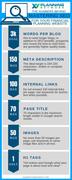
9. SEO Best Practices
Let me begin by saying I am not an SEO expert, but I don’t think there is any reason to be intimidated by SEO. Limited knowledge and a few best practices should serve us all just fine.
First, churning out fresh content on a regular basis is important for SEO purposes. Blog, then blog again, then blog some more. Google doesn’t think too kindly of sites that haven’t added new content in years.
Figure out your primary keyword per page. What is the page about? What will visitors search to find it? Put that keyword prominently in your meta description, your H1 tags, your page title, the alt text of your images, and your copy. It will also go into your image file names and the page’s URL; for those, separate long-tail keywords with dashes when necessary, like so: paying-for-medical-school.
There is some debate about the optimal number of times to mention keywords on a single page, with some fearing blowback from Google for “keyword stuffing.” I won’t bore you with an aside about keyword density, but I will recommend you simply write naturally. Don’t underestimate Google’s ability to sniff out authenticity.
Finally, internal links (links that direct visitors to other content on your site) are helpful, but be sure there are no broken links on your page. When including internal links, hyperlink relevant keywords like so:
Right: Download XYPN’s free First-Year Budget Template
Wrong: Download XYPN’s free First-Year Budget Template here
I’ve put together an infographic for you showing SEO best practices by the numbers, but please don’t hold me to these numbers forever! Google’s algorithm changes as the wind blows, and interpretations vary.
10. A Sprinkle of UI/UX Magic
Once you’re satisfied with your website, take it to the next level and become your own expert in UI/UX design, which focuses on the science of user experience.
Are your web visitors more likely to click a blue button or a green button? There’s only one way to find out! Go ahead and try both as you have time and watch your conversion rates.
How many people clicked the green button divided by the number of visitors to the page? How many clicked the blue button divided by the number of visitors to the page? Is the difference significant? Each small experiment like this gets you closer to a fully optimized website.
The bad news is your website is never “done.” There will always be more you can test and optimize. The good news is this can and should be done over time. I recommend starting by developing a list of your most important calls-to-action and pages. Make a plan to experiment with each and test at your own pace.
The ultimate goal, of course, is turning your website into a lead machine. For more guidance on perfecting your firm’s website, check out Kitces’ article, How The Best Financial Advisor Websites Turn Visitors Into Prospects And Clients.

About the Author
As XYPN's Director of Marketing, Jennifer Mastrud is tasked with sharing the movement at XYPN. Her expertise is in branding, marketing, and public relations. She’s as passionate about the XYPN message as she is about innovating new ways to share it. Before joining XYPN, Jen accumulated several years of experience representing national brands in diverse sectors including technology, gaming, TV, and education. She’s based in Minnesota, but travels frequently to warm up.
Share this
Subscribe by email

RIA SEO: Keyword Strategies for Financial Planners

Four (Doable) Ways to Dramatically Improve Your RIA's Website